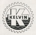
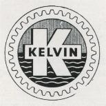
The Gearwheel K Logo was designed in the mid-50's and was the work of Bill Barbour (Sales Manager) and David Davidson (Draughtsman), now a Minister of the Kirk in Islay.
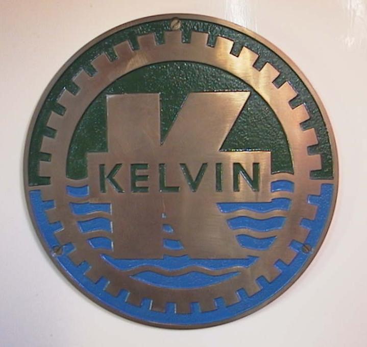
The one with the waves on blue (water) and the green above (land) is the correct design, it was originally a cast brass plate filled in with paint but when this became too expensive, they brought out the thin stick on version which was silver base colour, black gear teeth and green background.
Various interpretations were used over the years to suit the leaflets etc. There seems to be very little consistency both in design and colour. A TGSC6 leaflet dated October 1984 shows a black background with 12 gearteeth and the leaflet colour 'K' within the same colour circle. A letter dated December 1991 shows rectangular logo, background gold with a designer 'K' with gearteeth on angled legs adjacent to the vertical stroke, this 'K' is on black background and the words 'Kelvin Diesels' are in black beneath the designer 'K'.
The 9" dia. metal stick on discs were base colour silver with 32 black gearteeth and a 'K' with 'Kelvin' across it on a green background, this logo also appeared on the stationery, this was in the early Kyle Street days.
Lincoln Diesels reverted to this design, but with blue instead of Kelvin green. Lincoln Diesels also at one time used it on sales leaflets with an orange coloured background and 16 gearteeth, the circle and the 'K' being the paper colour.
British Polar are using this logo on their document covers.